

Your website is your university’s online hub for sharing information about research, news, student life, academics, athletics, and more. To paint your university in the best light, your website must provide your audience with a positive user experience (UX). This is especially important for prospective students!
According to Pew Research, 97% of teens say they use the internet daily, so they’ll likely turn to your university’s digital presence to get a sense of whether it’s a good fit. A study by Nielsen Norman Group shows that young adults seek qualities like easy-to-read text, engaging and interactive content, fast load speeds, and mobile functionality on the websites they visit.
Consider your university’s website: Does it offer these features, or could it do more to appeal to your audience? This post examines the qualities that contribute to a positive user experience on higher education websites and reviews some of the best university websites for UX.
What Makes for an Effective Higher Education Website User Experience?
Before discussing UX must-haves for your university website, let’s clarify what user experience means. User experience is the way visitors interact with your website. Clicking buttons and links, using your search function, and navigating from one page to the next are all elements of the user experience.
Kanopi’s guide to higher-ed website design highlights the following user experience necessities:
- Streamlined mobile experience: Your university’s website should be as easy to use on mobile devices as desktops and tablets. That means the mobile version of your website should feature a simple design, large buttons, and easy-to-read fonts.
- Straightforward user journeys: User journeys or pathways are personalized website experiences that appeal to unique audiences. For example, someone using your website to look for upcoming events will take different actions than someone looking for giving opportunities. Your website should feature clear pathways and resources for each of your unique audiences, including current and prospective students, faculty, staff, alumni, and parents.
- Uniform branding and navigation: To provide a seamless experience, use the same navigation techniques and menu styles for all site pages. Your website’s brand elements, including your logo, colors, and fonts, should also carry across all pages. This standardization creates a professional look for your website and reinforces brand recognition.
- Accessible content: Accessibility means your website is usable for all audiences, including people with disabilities. Accessible content is required by law for universities to ensure that information is available to everyone. Build your website with accessibility in mind by including alternative text for images and ensuring sufficient color contrast between foreground text and the background.
When paired with a simple, aesthetically pleasing design, these user experience basics can help your university’s website appeal to visitors and tell your story more effectively. Let’s review a few examples of higher education websites that embody these UX principles.
The University of Texas at Austin: Engaging User Experience
Visitors can assess your website’s visual appeal in as little as 50 milliseconds. That’s why making a positive first impression matters—something the University of Texas website excels at. The website immediately captures visitors’ attention with aesthetically pleasing colors and an engaging homepage video showcasing the best the university offers.
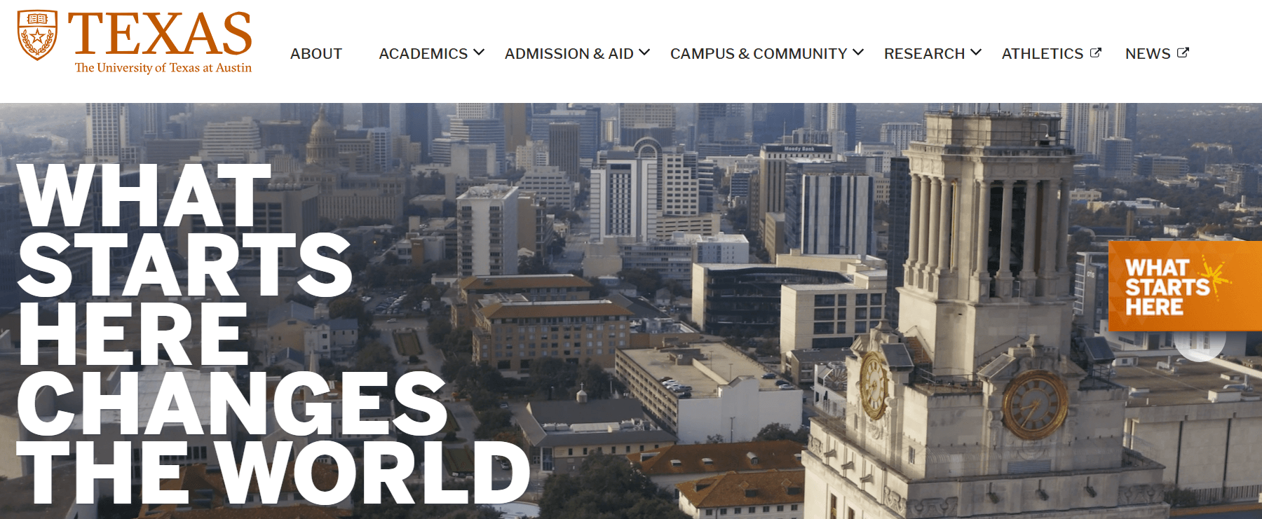
These elements in particular create an engaging user experience on the UT website:
- Dynamic parallax scrolling that tells a story through a combination of visuals and text
- Compelling homepage visuals that paint a robust picture of campus life and the university’s culture
- A unified message through the repeated use of the theme, “What Starts Here Changes the World”
What is the story your university wants to tell to its audience? Create a compelling message summarizing your college’s culture and philosophy to help guide your web design choices.
University of Arizona: Streamlined User Navigation
According to Double the Donation’s college website guide, “University students want to find information online quickly, whether dates and times of upcoming events, requirements for majors and minors, or contact information for their professors.” That’s why it’s essential to offer streamlined navigation and simple user pathways like on the University of Arizona website.
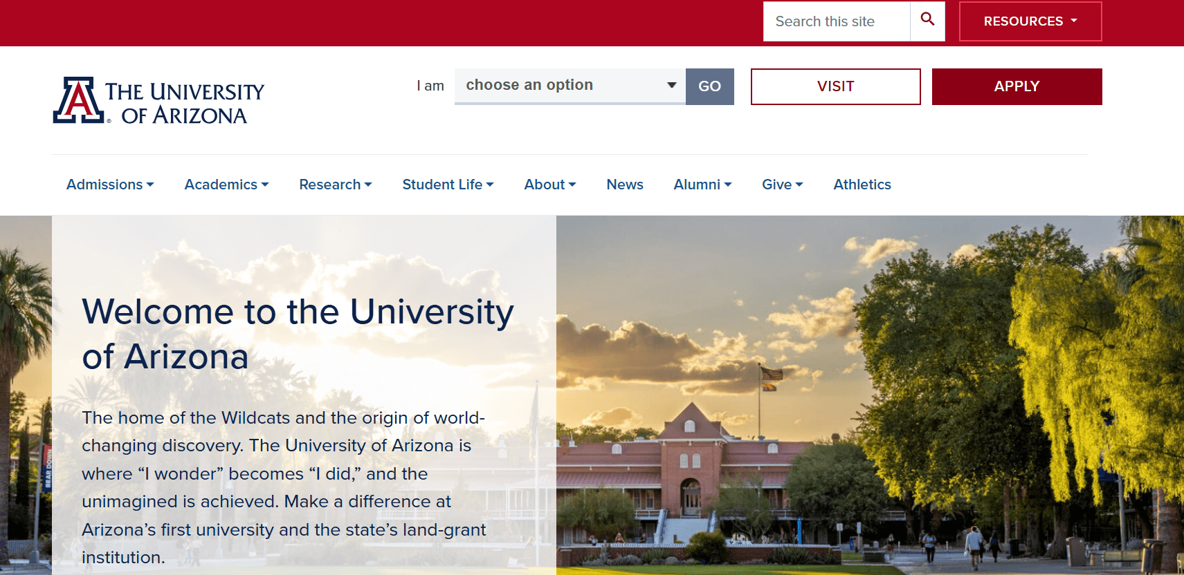
Take a look at a few elements that make the U of A website an excellent navigation example:
- The “I am” call to action (CTA) allows users to choose the group that aligns with their needs and access tailored information to complete their intended actions.
- The mobile pop-out hamburger menu keeps the user interface uncluttered in the mobile version.
- A simple site search tool makes it easy to directly search for specific resources or information.
Think about your university’s primary user groups. Does your website offer tailored CTAs and resources that form a clear pathway for each audience? If not, it’s worth it to identify your primary audiences and map out the user journey for each one to ensure all visitors can find the information they need.
Continually test your navigation over time to ensure all buttons and links function correctly and help users get further in their journeys.
The University of British Columbia: Mobile User Experience
The University of British Columbia’s website offers a professional, streamlined desktop version and an engaging experience for smartphone users. Mobile-friendliness is critical since 95% of teens have access to mobile devices.

Here are the features that make UBC’s mobile experience so successful:
- A simple design that makes effective use of white space to keep the page uncluttered
- A top-level menu that’s easy to read on mobile devices
- Large social media sharing buttons that let visitors instantly connect on social media
Think of your website’s mobile version. How can you adapt your brand elements and navigation to provide a seamless mobile experience? First, run your website through Google’s mobile-friendliness test. This tool will gauge your website’s functionality on mobile devices.
If your site isn’t mobile-friendly, the testing tool might identify specific errors, such as incompatible plugins or text that’s too small. Review your site in the mobile editor of your content management system (CMS) to adjust any elements that aren’t hitting the mark.
Cornell University: Accessible User Experience
Cornell University’s website is an effective example of accessibility for higher education institutions. Accessible websites provide an engaging, interactive experience for all visitors, giving everyone equal access to your online content.
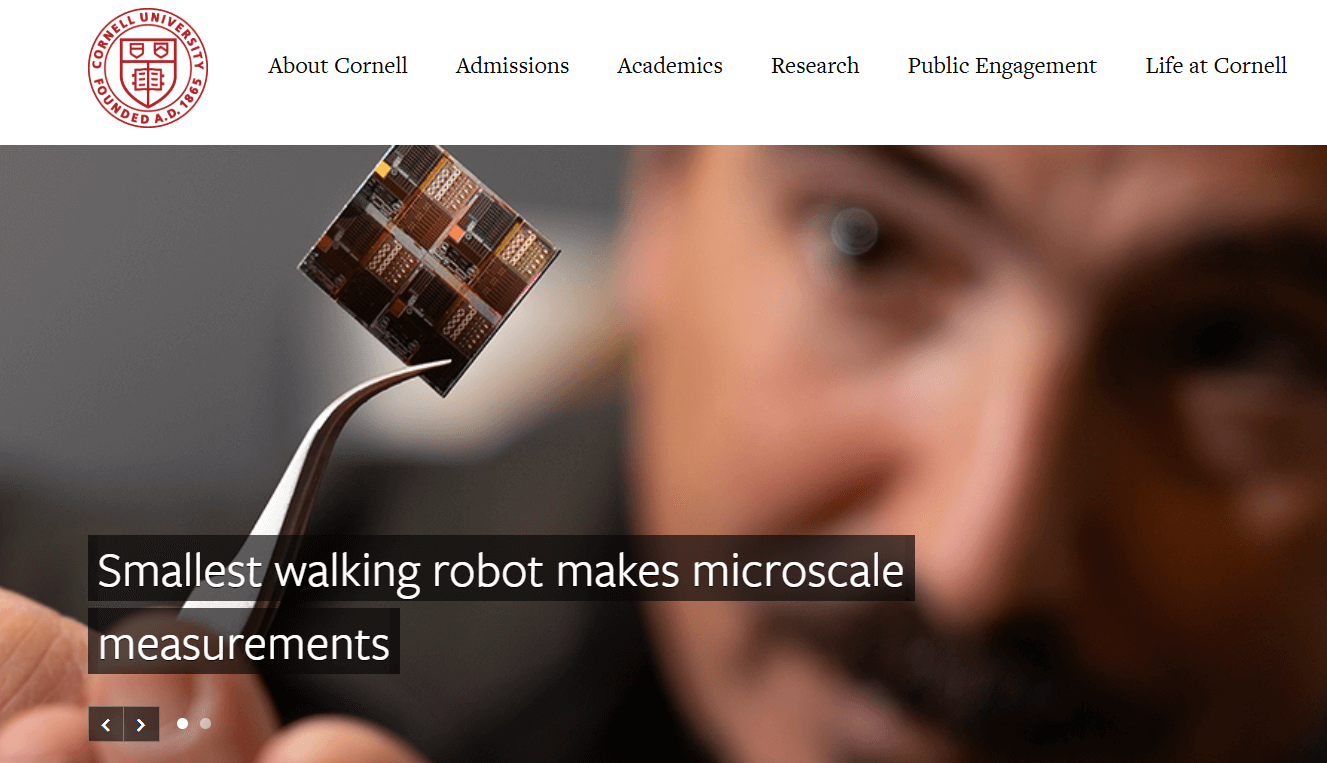
Here are a few of the elements that make Cornell’s website accessible to all:
- Strong color contrast between the text and the background that ensures all written copy is easy to read
- Descriptive alternative text for images that makes it easy for visitors using screen readers to interpret images
- A web accessibility assistance email that visitors can message with any accommodation issues
To ensure your university’s website achieves similar levels of accessibility, design it using the Web Content Accessibility Guidelines. These universally recognized accessibility principles offer clear steps for making a website more user-friendly.
Implementing these accessibility recommendations on a large scale can be complicated, so it’s recommended that you work with a higher ed website design agency that specializes in accessible design.
Western Washington University Department of Design: Creative User Experience
Your university’s website can still offer a user-friendly interface while incorporating creative design elements. Western Washington University’s Department of Design website is a great example of incorporating creativity into your user experience.
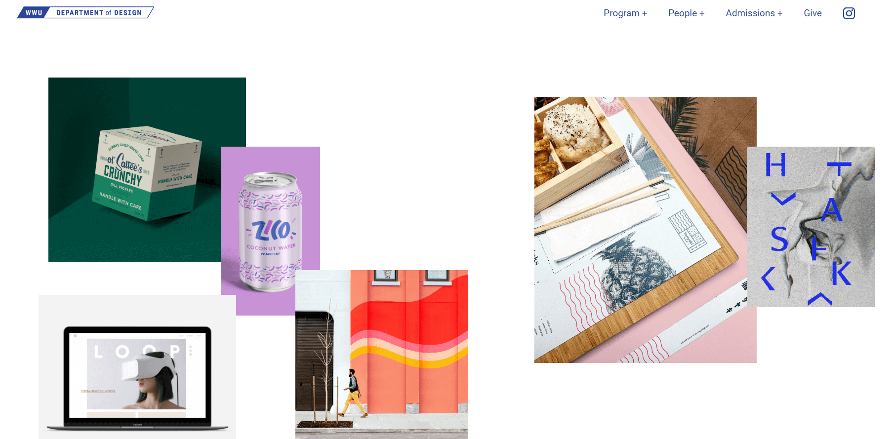
The WWU Design website features unique elements such as:
- Interactive homepage elements that allow visitors to create their own design
- Effective use of images and videos that show prospective students what it’s like to be a part of the design program
- A simplified menu that sticks to the need-to-know information, making navigation a breeze
You might consider incorporating similar elements into your website for your university’s art or design departments. Even if you’re designing your university’s main website, you can still find places to incorporate creative elements.
Whether you add an interactive timeline to your university’s history page or a dynamic image slideshow on your student life page, there are many creative ways to bring interactivity and engagement to your website.
Kenyon College: Unique User Experience
When you visit the Kenyon College website, you might first notice that it doesn’t look like the typical higher education website. Instead of a header with clear menu links and buttons, the website just includes the Kenyon logo at the top with a button that allows you to open a pop-out menu.
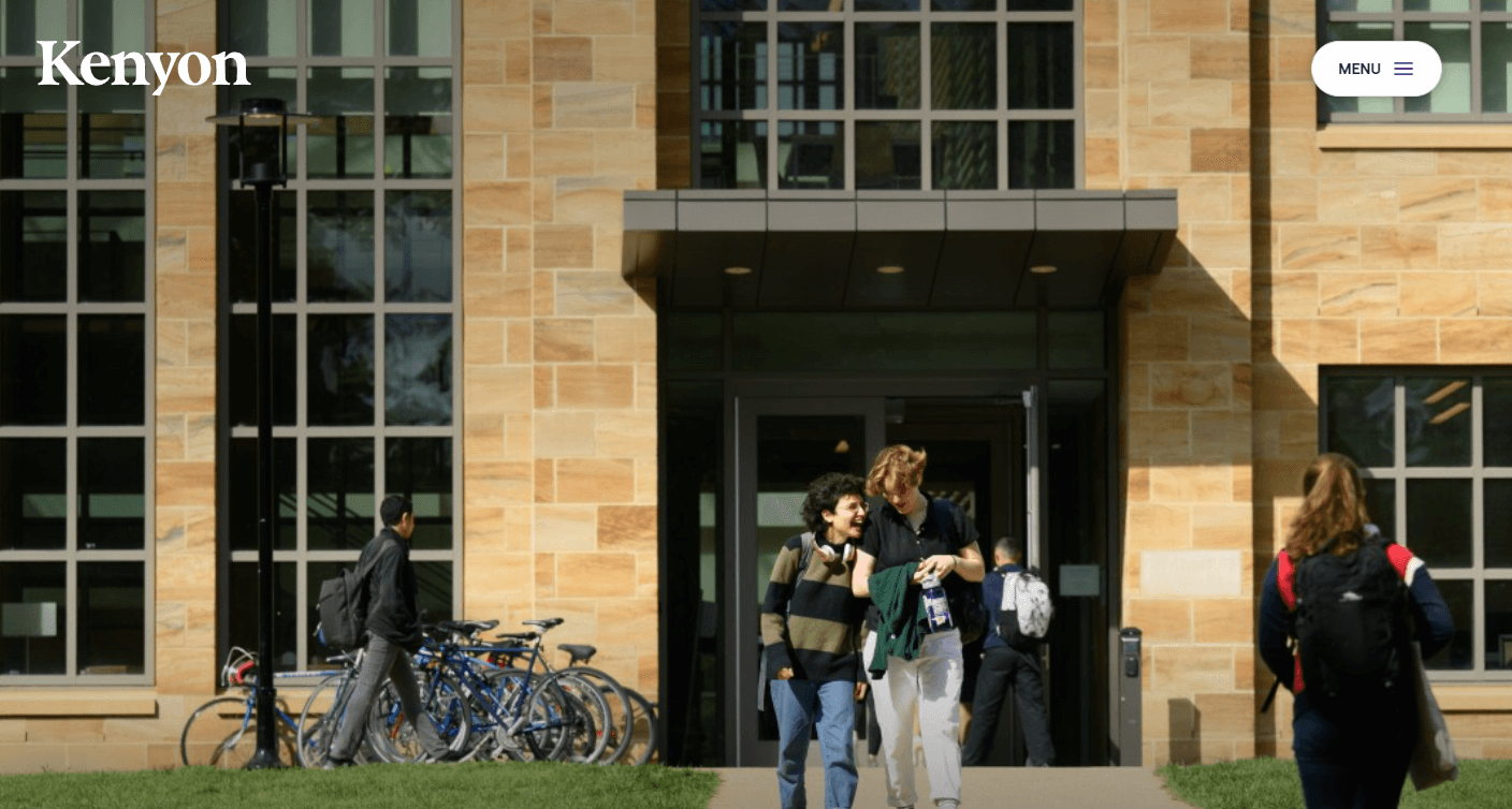
Here’s why this layout works:
- The striking header image offers a unique homepage experience, providing more visual intrigue.
- A comprehensive collapsable menu provides links for all user groups while keeping the homepage uncluttered.
- Users have multiple ways to explore the university online, including in writing, photos, statistics, or with an online tour.
Kenyon’s website offers a unique, engaging twist on the typical higher ed design best practices. Consider how you can think outside the box with your web design to present your university in the best light.
University of San Francisco: Data-Driven User Experience
According to a Gallup poll, Americans’ trust in higher education has recently declined sharply to 36%, lower than in two prior readings in 2015 (57%) and 2018 (48%). Universities must take this opportunity to showcase their credibility and commitment to positive student outcomes. The University of San Francisco website is an effective example of this.

Here are some of the ways the USF website builds audience trust:
- Positive student outcomes data are highlighted throughout the homepage, showcasing successes in social mobility, lifetime earnings, and more
- Strong research and historical focus, with relevant news and research throughout the homepage
- Spotlight on high rankings from credible third-party organizations, including Princeton Review and U.S. World News & Report
Similarly, you should use a combination of quantitative data and first-hand qualitative student experiences to paint a compelling picture of your university’s effectiveness. Combine information about awards and recognition your organization has received with student testimonials and outcomes data to make a strong argument.
Wrapping Up
A meaningful university marketing strategy starts with carefully considering the best ways to design your website’s user experience. Draw inspiration from these higher education website design best practices and examples for your own website to revamp your user experience and start connecting with a broader online audience.
Track key performance indicators, such as time spent on your website, conversion, and bounce rates, to identify your most successful strategies. Use this data to adjust your approach and focus on the UX elements your audience best responds to.